Each Graphics object gets a default name such as
graphics1,
graphics2, and so on, when it is created. These names are used to reference graphics objects in command sequences for buttons, menu items, and in methods. To reference graphics objects in a specific form, use the syntax:
form1/graphics2,
form3/graphics1, and so on.
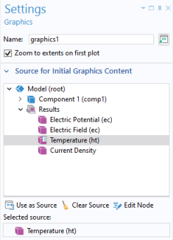
In the Settings window for a graphics object, use the section
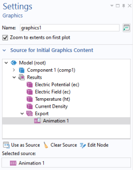
Source for Initial Graphics Content to set the plot group or animation to be displayed as default. To select, click
Use as Source or double-click a node in the tree. If a solution exists for the displayed plot group, the corresponding solution will be visualized when the application starts. The figure below shows the
Settings window for a graphics object with a
Temperature plot selected as the source.
In addition to Results plot nodes, you can also use
Animation,
Selection,
Geometry, and
Mesh nodes as the
Selected source.
Selecting the Zoom to extents on first plot checkbox ensures that the first plot that appears in the graphics canvas shows the entire model (zoom extents). This action is triggered once the first time that graphics content is sent to the graphics object.
In the section Data Picking, below
Source for Initial Graphics Content, selecting the
Enable data picking checkbox makes the graphics object interactive so that you can, for example, click on a plot at a particular point and retrieve a numerical value for the temperature at that coordinate. For more information, see
Data Picking.
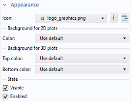
For a graphics object, the Appearance section of the
Settings window has the following options:
|
•
|
Include an Icon, such as a logo image, in the upper-right corner.
|
In addition, the subsection State contains settings for the visible and enabled state of the graphics object. For more information, see
Changing the Enabled and Visible State of a Form Object.
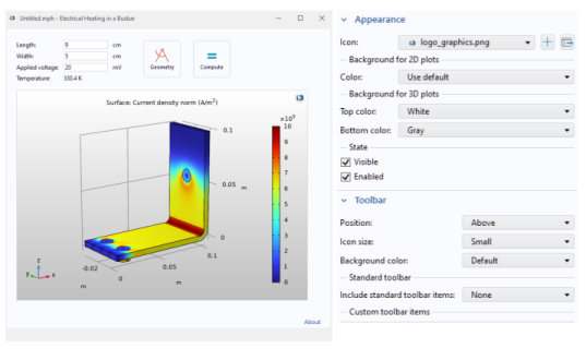
The figure below shows an application where the background Top color is set to white and the
Bottom color to gray. In addition, the standard plot toolbar is not included.
In the editor tree used in a command sequence of, for example, a button, the Graphics Commands folder contains commands to process or modify a graphics object. The figure below shows a command sequence with one command for printing the contents of a graphics object.
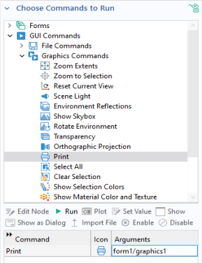
The available Graphics Commands include:
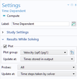
To let the user monitor convergence, you can plot the results while solving. In this example, assume that the Plot option is enabled for
Results While Solving. This option is available in the
Settings window of a
Study node in the model tree, as shown in the figure below.
You can include a method that calls the built-in sleep method for briefly displaying graphics information before switching to displaying other types of graphics. Insert it in a command sequence after a plot command, as shown in the figure below.
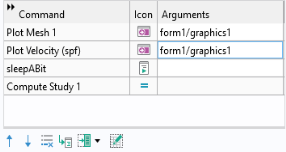
In this example, the sleepABit method contains one line of code:
In the command sequence above, the Plot Velocity command comes before the
Compute Study command. This ensures that the graphics object displays the velocity plot while solving.
In this context, two graphics objects with the same name but in different forms count as two different graphics objects. For example, form1/graphics1 and
form2/graphics2 represent two different graphics objects. In addition, if a graphics object is used in a subform (see
Form), then each use of that subform counts as a different graphics object.
The type of tree node used in the Source for Initial Graphics Content determines the type of toolbar that is shown. The toolbar will be different depending on the space dimension and whether the referenced source is a
Geometry,
Mesh,
Selection, or
Plot Group node. For example, the
Plot Group node displays an additional
Show Legends button.
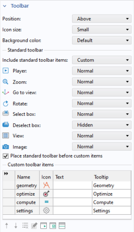
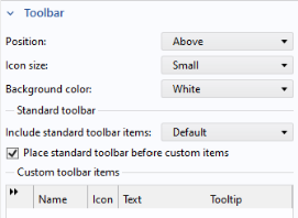
In the Settings window of a graphics object, in the
Toolbar section, you can control whether or not to include the graphics toolbar, as well as its position (
Below,
Above,
Left,
Right). In addition, you can choose between the options
Small or
Large for
Icon size,
Background color, and whether to
Include standard toolbar items or not.
The figure below shows the standard graphics toolbar as it appears when the Geometry or
Mesh node, for a 3D model, is used as a
Source for Initial Graphics Content.

When the Source for Initial Graphics Content is set to a
Selection, the graphics toolbar will contain three additional items:
Zoom to Selection,
Select Box, and
Deselect Box. This is shown in the figure below.

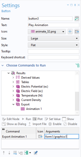
If the Source for Initial Graphics Content is set to an
Animation node, then additional buttons for playing the animation are added to the graphics toolbar, as shown in the figure below.

In the Toolbar section, you can also add custom buttons to the graphics toolbar. Use the buttons under the table to add or remove custom toolbar buttons (items). You can also move toolbar buttons up or down, add a
Separator, and
Edit a button. The figure below shows a standard graphics toolbar for results with four additional buttons to the right.

In the graphics toolbar of an application, the Go to Default View button (for 3D graphics only) will reset the current view to the default view.
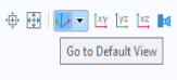
If you click the arrow next to this button, a menu will be displayed with all applicable views. The currently active view is indicated with a check mark.
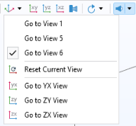
In addition to a list of all views, there is an option Reset Current View that will reset the currently active view to the state it had when the application was launched.
You can display animations in an application by using a Results >
Animation node as the
Source for Initial Graphics Content.
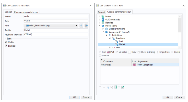
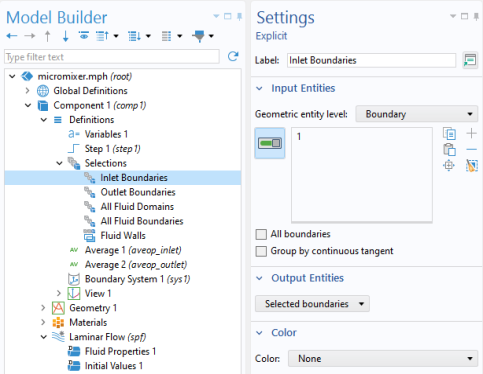
As an example of how selections can be used, consider selections for boundary conditions. When you select which boundaries should be associated with a certain boundary condition, you can click directly on those boundaries in the graphics window of the COMSOL Desktop environment. This is the default option called Manual selection (see below). These boundaries will then be added to a selection that is local to that boundary condition. Named selections instead let you define selections that can be reused for several different kinds of boundary conditions within a
Component by just selecting from a drop-down list. The figure below shows an
Explicit selection given the name
Inlet Boundaries with an associated boundary (
1).
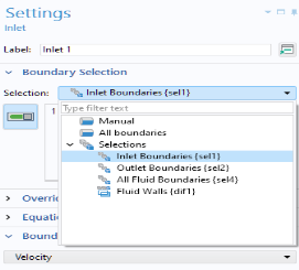
The figure below shows the Settings window for an
Inlet boundary condition where the
Inlet Boundaries selection is used. In this example, there are also selections for
Outlet Boundaries,
All Fluid Boundaries, and
Fluid Walls.
For convenience, in addition to the Manual option, there is also a shortcut for
All boundaries. The example above is available for download from this link:
www.comsol.com/model/app-with-cad-import-and-selections-86621. It demonstrates the use of ribbon buttons (items) for interactively selecting inlet and outlet boundaries in a microfluidics model.
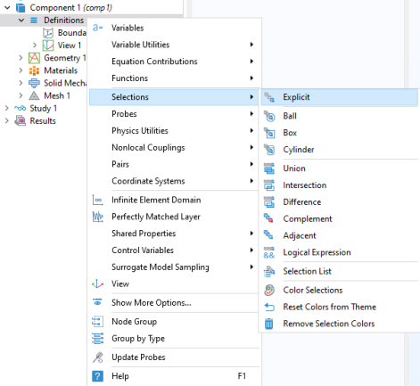
The Explicit selections, created under
Definitions, or by geometry or mesh sequences, let you group domains, boundaries, edges, or points based on entity number, and the example below illustrates how to work with this type of selection.
Explicit selections can be made interactive in an application, but other types of selections, such as a coordinate-based
Box selection, are shown in read-only mode.
You can allow the user of an application to interactively change which entities belong to an Explicit selection with a
Selection Input object or a
Graphics object. In the example below, the embedded model has a boundary condition defined with an
Explicit selection. Both a
Selection Input object and a
Graphics object are used to let the user select boundaries to be excited by an incoming wave.
The user can here select boundaries by clicking directly in the graphics window, corresponding to the Graphics object, or by adding geometric entity numbers in a list of boundary numbers corresponding to a
Selection Input object.
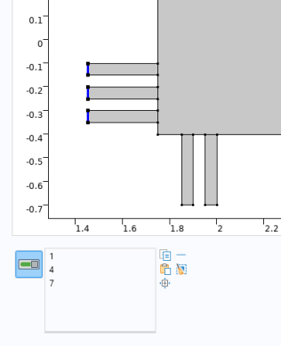
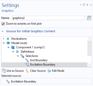
To make it possible to directly select a boundary by clicking on it, you can link a graphics object to an Explicit selection, as shown in the figure below. Select the
Explicit selection and click
Use as Source. In the figure below, there are two
Explicit selections,
Excitation Boundary and
Exit Boundary, and the graphics object
graphics2 is linked to the selection
Excitation Boundary.
To make it possible to select by number, you can link a Selection Input object to an explicit selection. For more information, see
Selection Input.
The Editor Tools window provides a quick way of adding a
Graphics object or a
Selection Input object that is linked to an
Explicit selection. To get these options, right-click an
Explicit selection node in the editor tree.
You can also let a global Event be triggered by an
Explicit selection by selecting it as the
Source for Data Change Event. This allows a command sequence or method to be run when the user clicks a geometry object, domain, face, edge, or point. For more information on using global events, see
Events and
Source For Data Change Event.
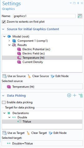
In the Settings window for a graphics object, select the
Data picking checkbox to make the graphics object interactive so that you can, for example, click on a plot at a particular point and retrieve a numerical value for the temperature at that coordinate. In the figure below, in the section
Target for Data Picking, a scalar double variable
Tvalue is selected. This variable is declared under the
Declarations node. In the running application, the value of the temperature at the pointer position will be stored in the variable
Tvalue.
If the Target for Data Picking is a 1D double array, then the stored value will instead correspond to the
x,
y (2D) or
x,
y, and
z coordinates at the clicked position.
The Target for Data Picking can be any one of the following: