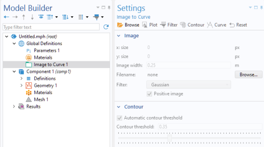
A Toolbar or
Form Toolbar object defines a toolbar and its buttons. The figure below shows a toolbar with several buttons, from the Image to Curve add-in, available in the Add-In Libraries under COMSOL Multiphysics.
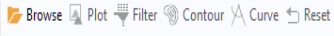
The Settings window for this toolbar (in this case a form toolbar) is shown in the figure below.
Each row in the Toolbar Items table contains either an
Item or
Toggle Item corresponding to a toolbar button or toggle button, respectively, or a
Separator. Use the buttons below the table to add items or separators, change the row order, or delete a row. Click the
Edit button to display the
Settings window associated with each row. The figure below shows the
Settings window of the
Browse item.
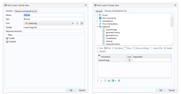
The text in the Tooltip field will be shown when hovering over the toolbar button. The text in the
Text field will be shown next to the icon, if any; otherwise just the text is shown. Similarly you can choose to just have an icon and no text. The
Icon list, the
Keyboard shortcut field, and the
Choose commands to run tree represent the same functionality as a button object. For more information, see
Button and Item.
A Toolbar form object can be placed anywhere in a form. A
Form Toolbar is a variant that can be added to a form’s header area and adapts intelligently based on the form’s context. For instance, if the form is used in a subwindow or as a settings form, the toolbar will be fixed at the top, even when the content below scrolls out of view. This ensures that the toolbar can always be easily accessible.