Clicking on a Button, ribbon, menu, or toolbar
Item is an event that triggers an action defined by its command sequence. The main section of the
Settings window for a button or item allows you to:
|
•
|
Use an Icon instead of the default rendering of a button.
|
|
•
|
Add a Tooltip with text that is shown when hovering over the button.
|
|
•
|
Add a Keyboard shortcut by clicking the input field and entering a combination of the modifier keys Shift, Ctrl, and Alt together with another keyboard key. Alt must be accompanied by at least one additional modifier. 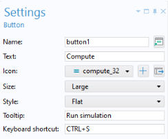
|
The settings for a ribbon button, defined as Item in a
Ribbon Section, are very similar to those of a button form object. However, in their respective settings windows, the sections and settings for
Dialog Actions,
Position and Size, and
Appearance are available only for the button form object. Similarly, the settings windows for menu and toolbar items are also closely aligned with those of a button form object.
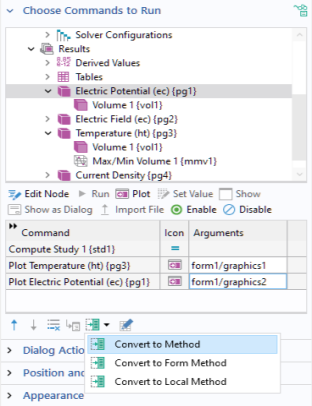
The section Choose Commands to Run lets you control the action associated with a button-click event. The figure below shows the
Settings window for a button that triggers a sequence of four commands.
A menu, ribbon, or toolbar item will also provide a Choose Commands to Run section in its
Settings window, and the functionality described in this section applies. For more information on using menu, ribbon, and toolbar items, see
Graphics Toolbar,
The Main Window Editor,
Table, and
Toolbar and Form Toolbar.
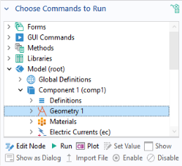
To define a sequence of commands, in the Choose Commands to Run section, select a node in the editor tree. Then click one of the highlighted buttons under the tree. Alternatively, right-click in the tree and select the command or double-click. In the figure below, the
Geometry node is selected and the available commands
Run and
Plot are highlighted. Click
Run to add a geometry-building command to the command sequence. Click
Plot to add a command that first builds and then plots the geometry. The option
Edit Node will take you to the corresponding node in the model tree or the application tree.

You do not need to precede a
Plot Geometry command with a
Build Geometry command (that you get by clicking
Run). The
Plot Geometry command will first build and then plot the geometry. In a similar way, the
Plot Mesh command will first build and then plot the mesh.
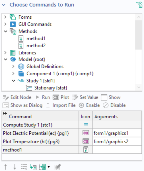
The example below shows the Settings window and command sequence for a
Compute button as created by the Form Wizard. This button has a command sequence with two commands:
Compute Study 1 and
Plot Temperature.
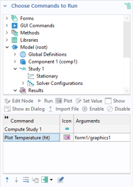
The Plot Temperature command has one argument,
form1/graphics1.
To add or edit an input argument, click the Edit Argument button below the command sequence, as shown in the figure below.
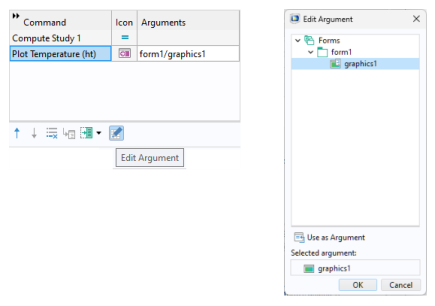
To reference graphics objects in a specific form, the following syntax is used: form1/graphics2,
form3/graphics1, and so on. If a specific form is not specified, for example,
graphics1, then the form where the button is located is used.
To control the order and contents of the sequence of commands, use the Move Up,
Move Down, and
Delete buttons located below the command sequence table.

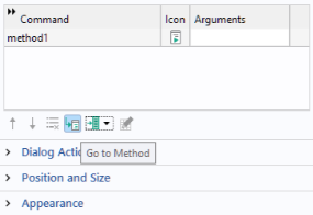
You can also create a method that is local to a form or form object by clicking
Convert to Form Method or
Convert to Local Method, respectively.
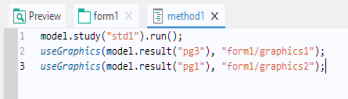
runs Study 1 corresponding to the model tree node containing the first study with tag
std1 (the first study node is called
Study 1 unless changed by the user). The second and third lines:
use the built-in method useGraphics to display plots corresponding to plot groups
pg3 and
pg1, respectively. In this example, the plots are displayed in two different graphics objects,
graphics1 and
graphics2, respectively.
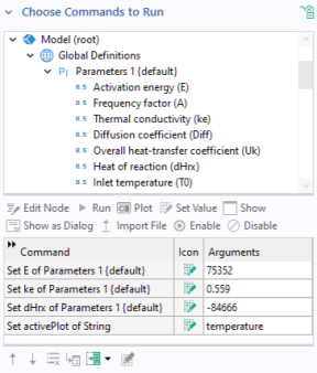
The Set Value command allows you to set values of parameters and variables that are available in the
Parameters,
Variables, and
Declarations nodes. In addition,
Set Value can be used to set the values of properties made accessible by
Data Access (see
Data Access in the Form Editor). The figure below shows a command sequence used to initialize a set of model parameters and a string variable.
A button on a form can also be used to display a new form. This can be done in two ways. The first is to use the Show command, which will replace the original form with the new form. The second is to use the
Show as Dialog command. In this case, the new form will pop up as a dialog over the current form, and will usually request input from the user.
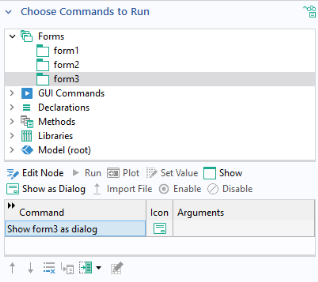
In the section Choose Commands to Run, you can select the
Show command. The figure below shows the command sequence for a button with a command
Show form3.
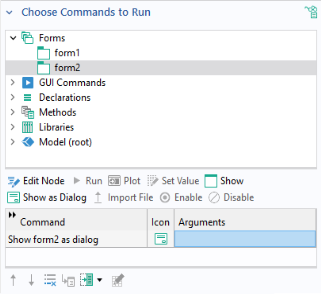
In order to use the Show as Dialog command, begin with the
Choose Commands to Run section and select the form that you would like to show. The figure below shows an example of the settings for a button with the command
Show form2 as dialog.
The form2 window in this example contains a text label object and an
OK button, as shown in the figure below.
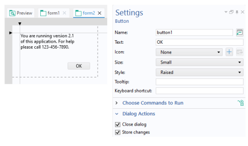
In the Settings window, the
Dialog Actions section has two checkboxes:
In the example above, the Close dialog checkbox is selected, ensuring that the
form2 window closes when the
OK button is clicked. Since
form2 has no user inputs, the
Store changes checkbox does not have any effect.
In order to control when data entered in a dialog is stored, there is a list in the Dialog Settings section of the
Settings window of a form where you can select whether to store data
On request or
Immediately when the change occurs, as shown in the figure below.
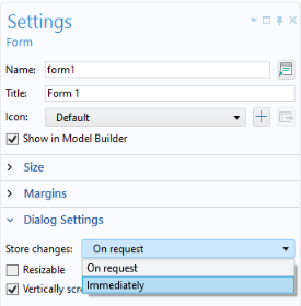
When the Store changes option
On request is selected, the variables that have been changed by the user in the dialog will not be updated until the OK button (or similar) in the dialog has been clicked. This requires that the
Store changes checkbox is selected, in the
Settings window of the OK button. When the option
Immediately is selected, variables changed by the user in the dialog is updated immediately including while the dialog is still open.
When Vertically scrollable is cleared, the form will never get any vertical scrollbar. Instead, the scrollbar will appear on the form objects inside the form, if possible. To obtain a satisfactory result, the form has to be created in grid mode. The form object which should get the scrollbar must be in a row with setting
Grow Row and its alignment set to
Fill Vertically.
In the Settings window for a button, the
Appearance section contains font settings as well as settings that control the state of the button object.
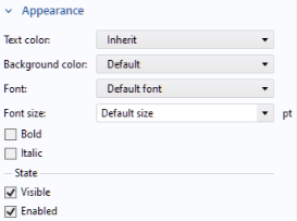
Whether or not the button object should be Visible or
Enabled is controlled from the checkboxes under the
State subsection. The
Appearance section for most form objects has similar settings, but some have additional options; for example, input field objects.
A button, or another form object, with the Visible checkbox cleared will not be shown in the user interface of the running application. A form object with the
Enabled checkbox cleared will be disabled, or “grayed out”, but still visible. The state of a form object can also be controlled using built-in methods. For example, assume that a Boolean variable
enabled is used to determine the enabled/disabled state of a button with
Name button3. In this case, you can control the state of the button as follows:
lets a Boolean variable visible control whether the button is shown to the user or not.