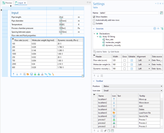
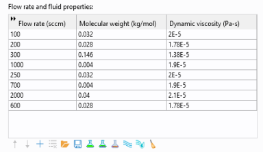
A Table Object represents a structured grid of rows and columns used for defining input, output, or displaying numerical data in tabular form. The figure below shows an example of a user interface of an app with a table object used to accept input in three columns.
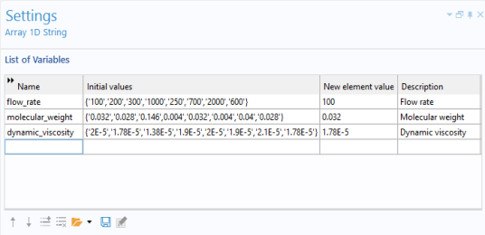
The Automatically add new rows checkbox ensures that an additional empty row is always available when a user is filling out a table. If all of the 1D string arrays, which are used as a source to the table, have nonempty values for
New element value in their declaration
Settings window, then this functionality is deactivated. In this case, new rows can only be added by clicking the
Add button in the associated table toolbar, if such a button has been made available.
The Sortable checkbox makes it possible to sort the table with respect to a particular column by clicking the corresponding column header.
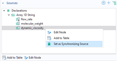
The Sources section contains a table with five columns:
Each row in this table defines a column in the table object. The option Grow allows individual columns to grow when a form is resized. This option is only applicable to grid mode and if the
Horizontal alignment of the table is set to
Fill.
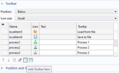
The Icon size setting allows you to choose
Small or
Large icons.
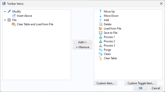
In addition, you can add customized items by clicking Custom Item or
Custom Toggle Item in the
Toolbar Items dialog. The figure below shows the
Edit Custom Toolbar Item dialog used to define a customized button. The dialog has two tabs for a regular item and three tabs for a toggle item.
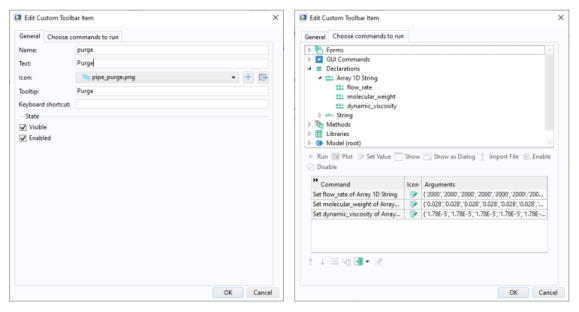
The Choose commands to run tab is similar to that of menu, ribbon, and toolbar items, as well as buttons.
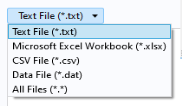
The Load from File and
Save to File buttons are used to load and save from/to the following file formats: