The Settings window of many types of form objects has a section that allows you to select a node in a tree structure that includes the model tree, or parts of the model tree, and parts of the application tree. Examples include the
Source section of an input field or the
Choose Commands to Run section of a button. There are many properties in the model and application trees that are not made available by default, because there may be hundreds or even thousands of properties, and the full list would be unwieldy. However, these “hidden” properties may be made available to your application by a technique called
Data Access.
By default, you can link input fields to parameters and variables defined in the model tree under the Parameters or
Variables nodes and to variables declared in the application tree under the
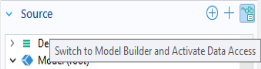
Declarations node. To access additional model tree node properties, click the
Switch to Model Builder and Activate Data Access button in the header of the
Source section of the input field
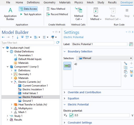
Settings window, as shown in the figure below.
You can also access it from the Application group of the
Developer tab in the Model Builder workspace
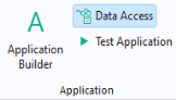
or from the Home tab in the Application Builder workspace.
The figure below shows the Settings window for an input field. The list of possible sources for this field now contains the
Electric potential.
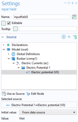
In addition, as shown in the figure above, Data Access allows you to access the
Editable checkbox and the
Tooltip text of the input field form object. This follows a general pattern: Beyond the settings in the Model Builder,
Data Access provides access to certain properties within the Application Builder.
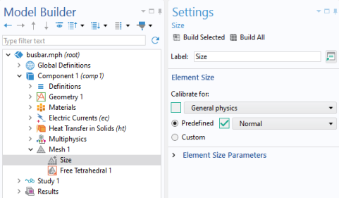
Data Access can be used for buttons to set the value of a parameter, variable, or a model property. For example, you can create buttons for predefined mesh element sizes. The settings shown in the figure below are available when, in the
Settings window of the
Mesh node, the
Sequence type is set to
User-controlled mesh. In this example, the
Predefined property for
Element Size has been made available and then selected.
The figure below shows the Settings window for a button used to create a mesh with
Element Size >
Predefined set to
Fine.
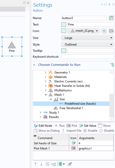
In the above example, a Set Value command is used to set the value of the
Predefined mesh size (hauto) property. The property
Predefined mesh size (hauto) corresponds to the following settings in the
Size node shown earlier:
The value of the hauto property is a double and can take any non-negative value. For non-integer values, linear interpolation is used for the custom mesh parameters. You can, for example, let a slider object adjust the predefined mesh size. For more information on the slider object, see
Slider.
The table below summarizes the availability of Data Access for form objects and events, as well as menu, toolbar, and ribbon items.
A global event, menu, ribbon, or toolbar item provides a Choose Commands to Run section in its
Settings window, to which the functionality described above in the section on buttons also applies. Global events and many form objects provide a
Source section in its
Settings window, and the functionality described above in the section on input fields applies. For information on global events, menus, ribbons, and toolbar items, see
Graphics Toolbar,
The Main Window Editor,
Events,
Table, and
Toolbar and Form Toolbar.