An Input Field allows a user to change the value of a parameter or variable. In the Form Wizard, when a parameter or variable is selected, three form objects are created:
|
•
|
A Text Label object for the parameter or variable description.
|
|
•
|
An Input Field object for the value.
|
|
•
|
A Unit object (if applicable) that carries the unit of measure.
|
By selecting a parameter or variable using the Editor Tools window, the same three form objects are created.
Assuming you do not use the Editor Tools window: To insert an input field as a separate form object, click the
Input Field button in the
Form Objects section of the ribbon
Form tab. In the Form Editor, you link an input field to a certain parameter or variable by selecting it from the tree in the
Source section and click
Use as Source. In the
Source section of the
Settings window, you can also set an
Initial value. The figure below shows the
Settings window for an input field.
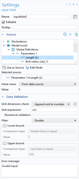
In addition to parameters and variables, input fields can use an Information node variable as a source, provided the
Editable checkbox for the input field is cleared.
The default setting for the Initial value is
From data source. This means that if the source is a parameter, then the initial value displayed in the input field is the same as the value of the parameter as specified in the
Parameters node in the Model Builder. The other
Initial value option is
Custom value, which allows an initial value different from that of the source. If the
Editable checkbox is cleared, then the
Initial value will be displayed by the application and cannot be changed. This makes it possible to use an
Input Field an alternative to, for example, a
Text Label object for displaying text or a
Data Display object for displaying numerical values.
You can add a Tooltip with text that is shown when hovering the mouse pointer over the input field.
The header of the Source section contains buttons for easy access to tools that are used to make additional properties and variables available as sources to the input field.
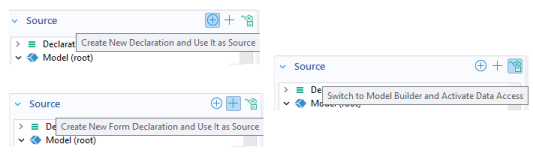
The Create New Declaration and Use It as Source button can be used to add new variables under the
Declarations node. For more information, see
Declarations. The
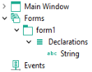
Create New Form Declaration and Use It as Source button can be used to add new variables under the
Declarations nodes local to forms, as shown below.
The Switch to Model Builder and Activate Data Access button can be used to access low-level model properties as described in the next section. For more information on
Data Access, see
Data Access in the Form Editor.
The Data Validation section of the
Settings window for an input field allows you to validate user inputs with respect to units and values.
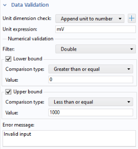
When creating an input field in the Form Wizard, the setting Append unit to number is used when applicable. This setting assumes that a user enters a number into the input field, but it can also handle a number followed by a unit using the COMSOL square bracket
[] unit syntax. If the
Unit expression is
mm, then
1[mm] is allowed, as well as any length unit, for example,
0.1[cm]. An incompatible unit type will display the
Error message. A parameter that has the expression
1.23[mm], and that is used as a source, will get the appended unit
mm and the initial value displayed in the edit field will be
1.23.
The Unit dimension check list has the following options:
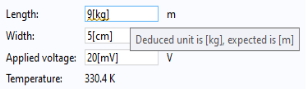
A yellow squiggly underline indicates a warning when a user enters an incompatible unit, which is a unit that cannot be converted to the units specified in the Data Validation settings. Enable this feature by selecting
Compatible with physical quantity or
Compatible with unit expression. In addition, the user will see a tooltip explaining the unit mismatch, as shown in the figure below.
A button Add Unit Label is available to the right of the
Unit dimension check list.
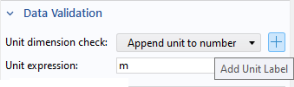
Clicking this button will add a unit label to the right of the input field if there is not already a unit label placed there.
The None option does not provide unit validation.
The options Append unit to number,
Append unit from unit set, and
None allow you to use a filter for numerical validation of the input numbers.
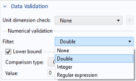
The Filter list for the option
None has the following options:
The Filter list for the options
Append unit to number and
Append unit from unit set only allows for the
Double and
Integer options.
The Double and
Integer options filter the input based on the
Lower bound and
Upper bound values. If the input is outside of these values, the
Error message is displayed. You can use global parameters in these fields. If global parameters are used, you can define such parameters with or without units. If you use global parameters without a unit, then only the numerical value of these parameters is considered. For example, consider data validation of an input field for a length parameter
L with unit
cm. Further, assume that a global parameter
Lmax is used as the
Upper bound value. If you would like the maximum value of
L to be 15 cm, then the following values for the parameter
Lmax will work:
15 (with no unit),
15[cm],
0.15[m],
150[mm], and so on. In the
Lower bound and
Upper bound fields, you can use Ctrl+Space to browse available parameters and for autocompletion.
For the Append unit from unit set option, the
Lower bound and
Upper bound values are always with respect to the
Initial value for the unit set by the unit set. For more information on unit sets, see
Unit Set.
The Regular expression option, available when the
Unit dimension check is set to
None, allows you to use a regular expression for matching the input string. For more information on regular expressions, see the dynamic help. Click the help icon in the upper-right corner of a window and search for “regular expression”.
For additional information on how to use more advanced Data Validation features and how to use method code to perform data validation, see the
Application Programming Guide.
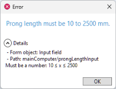
You can customize the text displayed by the Error message. During the development and debugging of an application, it can sometimes be hard to deduce from where such errors originate. Therefore, when using
Test Application, additional debugging information is displayed, as shown in the figure below.
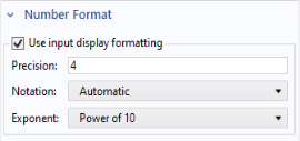
The Number Format section contains a
Use input display formatting checkbox. If selected, it enables the same type of display formatting as a
Data Display object.
In addition to color and font settings, the Appearance section for an input field contains a
Text alignment setting that allows the text to be
Left,
Center, or
Right aligned.
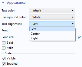
Whether the input field should be Visible or
Enabled is controlled from the checkboxes under the
State subsection. For more information, see
Changing the Enabled and Visible State of a Form Object.