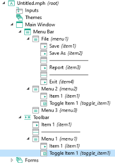
The Menu Bar node can have
Menu child nodes that represent menus at the top level of the
Main Window.
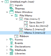
For the Menu Bar option, a
Toolbar node is made available. The
Toolbar node and the
Menu nodes have the same type of child nodes.
The child nodes of the Menu and
Toolbar nodes can be of type
Menu,
Item,
Toggle Item, or
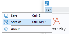
Separator, exemplified in the figure below:
7
A Menu node can have child
Menu nodes that represent submenus.
A Separator displays a horizontal line between groups of menus and items, and has no settings.
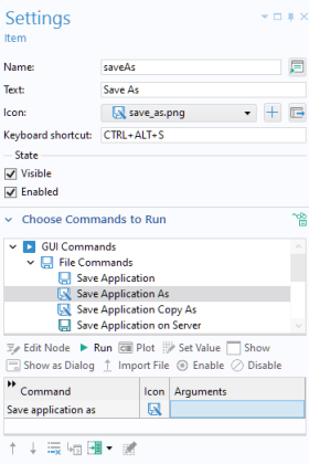
The Settings window for an
Item node is similar to that of a button and contains a sequence of commands. Just like a button, an item can have associated text, an icon, and a keyboard shortcut. For more information, see
Button and Item. In a similar way, the
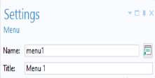
Settings window for a
Toggle Item node is similar to that of a toggle button.
The figure below shows the Settings window for an
Item associated with a method for saving an application using the command
Save Application As.