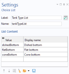
The Choice List node contains lists that can be used by combo boxes, radio buttons, or list boxes. The
Settings window for a choice list contains a
Label, a
Name, and a table with a
Value column and a
Display name column. Enter the property value (
Value) in the first column and the corresponding text to display to the user (for example, in a combo box list) in the second column (
Display name). The
Value is always interpreted as a string. In the example below,
Dished bottom will become the string
dishedBottom when returned from the combo box.
As an alternative to creating a choice list by right-clicking the Declarations node, you can click the
Add New Choice List button in the Settings window for form objects that use such a list, as shown in the figure below.
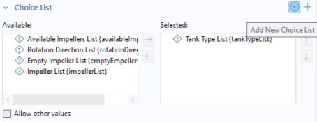
In addition you can click the adjacent Add New Form Choice List to create a choice list local to the form.
You can right-click the Choice List node to add an
Activation Condition subnode. Use an activation condition to switch between two or more choice lists contingent on the value of a variable. For an example of using choice lists with activation conditions, see
Using a Combo Box to Change Material.