You are viewing the documentation for an older COMSOL version. The latest version is
available here.
When you click the Change Color Table button (

) next to the thumbnail and name of the current color table in a plot’s settings, the
Color Table window appears. In that window you can choose a color table for the plot. You can also see what the color tables look like by clicking a color table; the plot is updated immediately to show the plot using that color table. The color tables are divided into the following categories:
|
•
|
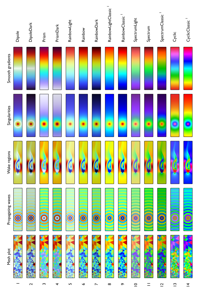
Rainbow (  ): The various Rainbow, Prism, Dipole, Spectrum, and Cyclic color tables.
|
|
•
|
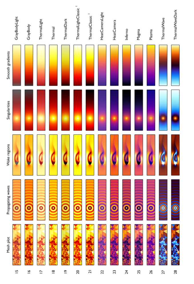
Thermal (  ): The various Thermal. GrayBody, HeatCamera, Inferno, Magma, and Plasma color tables.
|
|
•
|
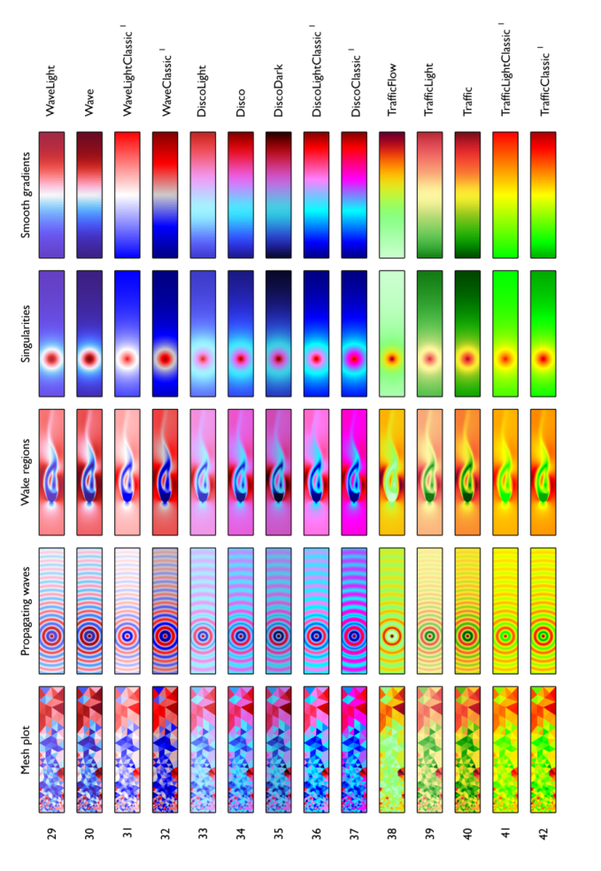
Wave (  ): The various Wave and Disco color tables.
|
|
•
|
Traffic (  ): The various Traffic color tables.
|
|
•
|
Aurora (  ): The various Aurora and Twilight color tables.
|
|
•
|
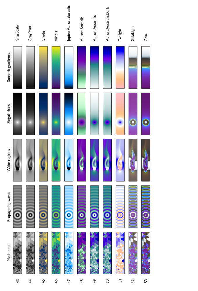
Linear (  ): The GrayScale, GrayPrint, Cividis, and Viridis color tables.
|
|
•
|
Geoscience (  ): The Gaia and GaiaLight color tables.
|
There is also a Recently Used category (

), which contains the most recently used color tables. An
In Model category (

) is also available if any custom color tables have been added to the model (and then appear as
Color Table nodes under
Color Tables).
|
|
All color tables in the Linear category are linear, but there are linear color tables in other categories as well (for example, Inferno, Magma, and Plasma).
|
Use the Collapse All (

) and
Expand All (

) buttons in the lower-left corner of the
Color Table window to open or close all categories. Click the
Import button (

) to choose a color table file from the file system. That color table is then added to the list under
In Model and is selected as the color table to use. A corresponding
Color Table node is also added under
Color Tables.
To filter (search) the list of color tables, type a filter text in the text field at the top of the Color Table window and then click the
Filter button (

). For example, type
dark in the filter text field and the click the
Filter button to show all dark versions of the color tables. Use an empty filter text field to restore the full list.
Click OK to use the selected color table in the plot.
The AuroraAustralis (

),
AuroraAustralisDark (

),
AuroraBorealis (

), and
JupiterAuroraBorealis (

) color tables resemble the colors in the aurora australis (southern light), aurora borealis (northern light), and Jupiter’s aurora, respectively. The AuroraAustralis color table spans from white through green and indigo to blue. The AuroraAustralisDark color is similar to AuroraAustralis but does not start with absolute white so that the end value’s color is different from a white background. The AuroraBorealis color table also spans from white through green and indigo to blue but with a larger indigo portion. The JupiterAuroraBorealis color table spans from black through blue to white.
The Twilight (

) color table uses colors associated with twilight (the illumination of Earth’s lower atmosphere when the Sun is not directly visible), spanning colors from pink through white to blue.
The Cividis (

) color table uses yellow and blue colors in a color table that is suited for normal vision, a deuteranomaly, or red-green colorblindness. It was created by Jamie Nuñez, Ryan Renslow, and Chris Anderton at the Biological Sciences Division of the Pacific Northwest National Laboratory (located in Richland, Washington state, United States).
The Cyclic (

) and
CyclicClassic (

) color tables are useful for displaying periodic data. Examples are the phase variation of a propagating wave or its polarization angle. Another typical use case for Cyclic is the visualization of seemingly random data having many discrete levels (domain numbers, terminal numbers, port numbers, and so on). For these cases, Cyclic is convenient because of the large number of colors it contains. The colors begin with red, then pass through yellow, green, cyan, blue, magenta, and finally return to red.
Dipole (

) has been developed for plots where the majority of the solution is close to zero (or centered around some meaningful reference point) and where, in some places, positive and negative excitations occur. Typical cases are the electric potential distribution around positively and negatively charged objects with the field relaxing to zero at infinity and the pressure distribution of an acoustic wave propagating in a large open space. For those cases, the scale tends to white in areas of relative inactivity, allowing for a good contrast with titles, legends, dataset edges, and other plot elements. This reasoning is similar to the one used for the Prism color table. The main difference is that Dipole is symmetric (or “diverging”), making it suitable for positive and negative scalar fields, whereas Prism is more suitable for vector field norms (which are positive only).
DipoleDark (

) is similar but uses slightly darker colors.
The Disco (

) and
DiscoClassic (

) color tables span from red through magenta and cyan to blue. Like Rainbow, Disco has not been optimized for a particular use case. Unlike Rainbow, however, it has a strongly nonsymmetric luminance curve. This makes it less suitable as a general-purpose tool. Disco is typically not the first choice, but when an illustration already contains variants of Rainbow — or when Rainbow needs to be avoided for other reasons — Disco may provide an attractive alternative.
DiscoDark (

) and
DiscoLight (

) are similar but use darker and lighter colors, respectively.
The Gaia (

) color table spans colors that make it suitable for plots related to topography and bathymetry. At its center the color table has a zero point, representing sea level. The bottom half is intended for depth measurements (below sea level), and the top half represents height measurements (above sea level). The colors resemble water, snow, and different kinds of soil or vegetation, for different levels of elevation. As a result, an elevation plot using this color table will start to look like a landscape. In order to allow for a higher level of detail close to sea level, the colors in the color table have been pushed to the center using a logarithmic map. The colors have been calibrated for central Europe, with the data ranging from
−4 km depth to
+4 km height.
GaiaLight (

) is similar but uses lighter colors.
The GrayBody (

) color table is based on the Planckian locus for blackbody radiation. It is useful within the context of metal processing, for example.
GrayBodyLight (

) is similar but uses lighter colors.
The GrayScale (

) color table uses the linear gray scale from black to white — the easiest palette to interpret and order.
The GrayPrint (

) color table varies linearly from dark gray (RGB: 0.95, 0.95, 0.95) to light gray (RGB: 0.05, 0.05, 0.05). Choose this color table to overcome two difficulties that the GrayScale color table has when used for printing on paper — it gives the impression of being dominated by dark colors, and white is indistinguishable from the background.
The HeatCamera (

) and
HeatCameraLight (

) color tables resemble the typical scale used for thermography applications. Here, the lighter colors red, orange, and yellow correspond to higher temperatures (and more radiated heat). The purples and the blues refer to cooler temperatures and less radiation. HeatCamera is used as the default color table for plots involving one of the heat transfer physics interfaces. For a smoother and more perceptually uniform option, consider Inferno, Magma, or Plasma.
The Inferno (

),
Magma (

), and
Plasma (

) color tables use a general bluish to reddish to yellowish color sequence, which is relatively friendly to common forms of color vision deficiencies. They are designed so that they are analytically perceptually uniform, both in regular form and when converted to black-and-white images. They were created by Stéfan van der Walt and Nathaniel Smith.
Prism (

) is slightly similar to the
Rainbow color table but includes a white tip and is brighter. It has been developed for plots where the majority of the solution is close to zero (typically at the outer perimeter of the modeling domain) and where, in some places, singularities or “hot spots” occur. This is especially true for electric and magnetic field norms in electromagnetic models, but may also occur for stress and strain norms in structural mechanics models, for example. For those cases, the scale tends to white in areas of relative inactivity, allowing for a good contrast with titles, legends, dataset edges, and other plot elements. This is the default color table for plots when using one of the structural mechanics physics interfaces. It is also used as the default option for plotting electric and magnetic field norms in the low-frequency electromagnetics interfaces.
PrismDark (

) is similar but uses slightly darker colors. It can be used, in combination with Prism, to add arrows or streamlines on top of a plane, for instance. Close to the hot spots the contrast between the two color scales increases, and in the wake regions the contrast will fade.
Rainbow (

) is the default for most plots that support color tables. The colors range through shades of blue, cyan, green, yellow, and red. This color table is not optimized for a particular use case (nor is it perceptually uniform), but it is not really bad for most use cases either. Consequently, it serves very well as a general-purpose tool for quick result assessment. The disadvantage of this color table is that people with color vision deficiencies (affecting up to 10% of technical audiences) cannot see distinctions between reds and greens.
RainbowClassic (

) is the rainbow color table used in versions of COMSOL Multiphysics earlier than version 6.0. Compared to RainbowClassic, the current Rainbow color table is less saturated, more uniform, more smooth, and more balanced.
RainbowDark (

),
RainbowLight (

), and
RainbowLightClassic (

) are similar to Rainbow but use darker and lighter colors, respectively.
Spectrum (

) and
SpectrumClassic (

) are similar to the
Rainbow color tables but include violet at the short-wavelength end of the visible spectrum. They also include richer shades of green and less yellow and cyan to more closely replicate the human perception of visible light. The saturation and hue distribution have been derived from the chromatic response of the CIE 1931 Standard Observer. The included wavelengths range from 415 nm to 660 nm.
SpectrumLight (

) is similar but uses lighter colors. You can use them with the Ray Optics Module, for example, to accurately visualize polychromatic light.
Thermal (

) and
ThermalLightClassic (

) more or less resemble the radiation pattern of a glowing piece of metal, where lighter colors refer to higher temperatures. These color tables are not optimized for a particular use case, but they are not really bad for most use cases either: Like Rainbow, the serve very well as general-purpose tools. However, for a more accurate approximation of a radiating graybody, consider one of the GrayBody color tables instead.
ThermalLight (

) is similar but use lighter colors.
ThermalDark (

) and
ThermalClassic (

) are similar but use darker colors.
ThermalWave (

) is designed for wave phenomena of a thermal nature. It is used in one of the default plots for the thermoviscous acoustics and linearized Navier–Stokes physics. The colors relate to orange and blue flames, and the luminance distribution is calibrated to be fully symmetric.
ThermalWaveDark (

) is similar to ThermalWave but with darker colors, in particular in the center. The advantage is a stronger contrast and a more vibrant plot, and the disadvantage is that the darker colors do not contrast well with titles, legends, and dataset edges.
The Traffic (

) and
TrafficClassic (

) color tables span from green through yellow to red.
TrafficLight (

) and
TrafficLightClassic (

) are similar but use lighter colors. The
TrafficFlow (

) color table is specifically designed for visualizing mesh quality. The green half has a very soft gradient: All good mesh elements have about the same color when using a reversed TrafficFlow color table. This makes it much easier to focus on the mesh elements with a low quality.
The Viridis (

) color table uses a general bluish to greenish to yellowish color sequence, which is relatively friendly to common forms of color vision deficiencies. It is designed so that it is analytically perceptually uniform, both in regular form and when converted to a black-and-white image. It was created by Stéfan van der Walt and Nathaniel Smith.
The Wave (

) and
WaveClassic (

) color tables are useful for data that naturally has positive and negative attributes in addition to a magnitude. Like ThermalWave, Wave has two clearly distinct hues on both sides of the center to indicate “negative” (blue) and “positive” (red) values, and it has a symmetric luminance distribution. The Wave color table has been deliberately designed to be strongly nonlinear to support acoustic wave patterns with hotspots (singularities) and radiating point sources while also clearly resolving the far field. This color table is used as a default for many acoustics applications. Oftentimes, it is used together with the
Linear symmetric setting in the
Scale list for the color table scaling.
WaveLight (

) and
WaveLightClassic (

) are similar but use lighter colors.