Results
Datasets
Create a surface dataset to view the pressure on the channel walls.
1
2
3
In the Paste Selection dialog, type 1 3 5 6 7 8 11 12 13 14 15 17 18 19 20 21 22 24 26 27 in the Selection text field.
4
Velocity (Uncoupled Flow)
First plot the velocity of the flow within the channel.
1
2
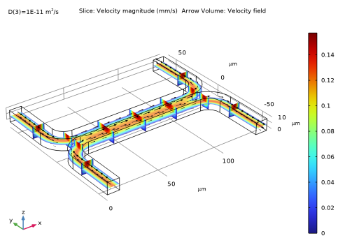
In the Settings window for 3D Plot Group, type Velocity (Uncoupled Flow) in the Label text field.
Slice 1
Use a slice plot to view the data on one or more slices through the geometry.
1
2
Slice 2
Add additional slices in different directions.
1
2
3
-
-
The extra slices should use the same scale and colors for the velocity plot as the existing slice.
4
To avoid duplicate titles, turn off the title for additional slices.
5
Slice 3
Add slices in a third plane.
1
2
-
-
Arrow Volume 1
Use the arrow volume plot to visualize the flow direction.
1
2
-
-
-
3
4
Next add a pressure plot, using the dataset created previously.
Pressure (Uncoupled Flow)
1
2
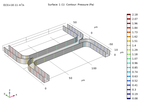
In the Settings window for 3D Plot Group, type Pressure (Uncoupled Flow) in the Label text field.
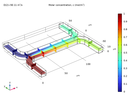
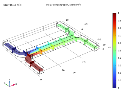
3
Surface 1
Add a uniformly colored surface to highlight the channel walls.
1
2
3
-
-
Contour 1
Next use contours to visualize the pressure.
1
2
3
Next create a slice plot to visualize the concentration in the device. Use the existing velocity slice plot as a basis for this plot.
Concentration (Uncoupled Flow)
1
2
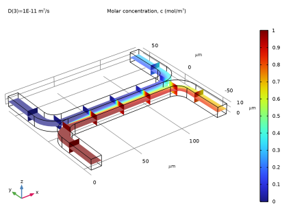
In the Label text field, type Concentration (Uncoupled Flow).
For each of the slice subnodes, change the plotted quantity to concentration.
Slice 1
1
2
Slice 2
1
2
Slice 3
1
Disable the arrow volume plot.
2
Concentration (Uncoupled Flow)
Look at the plot for each of the three diffusion coefficient levels.
1
2
The plots on the next page show the results for each of the diffusion coefficients solved for. For the heaviest species, which has the smallest diffusivity, there is limited mixing between streams A and B. For the lightest species, which has the largest diffusion coefficient, the mixing is almost perfect.
Add a global plot to show how the concentration at the output differs with diffusion coefficient.
Output Concentration (Uncoupled Flow)
1
2
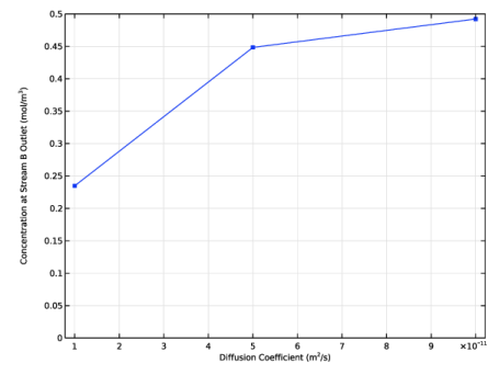
In the Settings window for 1D Plot Group, type Output Concentration (Uncoupled Flow) in the Label text field.
3
Use the built in variable to compute the average concentration at the device output.
4
5
6
Add a marker in the computed data points.
7
-
Change the axis titles.
Note: HTML tags and a range of mathematical symbols and Greek letters can be entered in the axes and plot titles. See “Using Special Formats and Symbols in Texts” in the “Results Evaluation and Visualization” chapter of the COMSOL Multiphysics Reference Manual for more information.
8
9
10
-
-
Select the y-axis label checkbox. In the associated text field, enter Concentration at Stream B Outlet (mol/m<sup>3</sup>).
Change the axis limits for the plot.
11
-
-
12
This plot shows that the concentration of the species at the output is strongly dependent on the diffusion coefficient of the molecule. Thus the device could be used to separate species with different diffusion coefficients, particularly if multiple stages of the device were arranged in series.
In some cases, particularly if the solution consists of large macromolecules, the dissolved species has a large influence on the liquid’s viscosity. In such situations, the Navier–Stokes and the convection–diffusion equations become coupled, and so they must be solved simultaneously.