A Card Stack is a form object that contains cards. A
Card is another type of form object, one that is only used in the context of a card stack. Flip between cards in a card stack to show one at a time. You associate a card stack with a data source that controls which card to show. Each card specifies a value that is compared against the data source of the card stack. The card stack shows the first card with the matching value. If no cards match, nothing is shown.
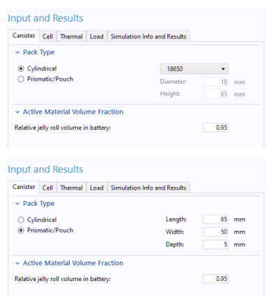
The example below is taken from the Lithium-Battery Designer application, see also Lithium Battery Designer. It shows how a card stack can be used to flip between two different sets of input parameters for a cylindrical and prismatic battery pack type, respectively. The settings of a radio button is used to control which of the two cards are shown.
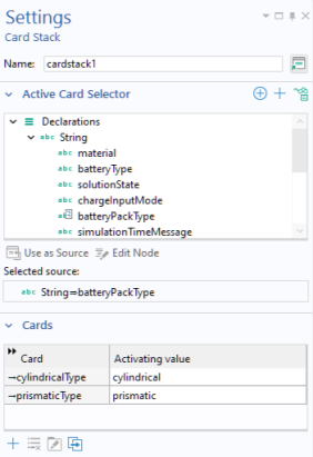
The figure below shows the corresponding card stack Settings window with two cards and a string variable
batteryPackType as its
Active Card Selector.
By clicking a row in the table of cards in the Cards section, followed by clicking one of the toolbar buttons below the table, you can perform the following operations on cards:
Each row in the table contains the name of the card in the Card column and their associated activating values in the
Activating value column. The stack decides which cards to display based on their activating values. In this example, the activating value is a string variable.
Clicking the Add Card button displays the following dialog.
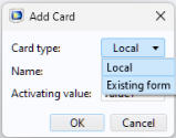
By default, the Card type is set to
Local, which means that the card is defined locally in its containing card stack object. If the
Card type is set to
Existing form, then you can instead select one of the existing forms. The settings for an
Existing form are accessed directly from the Form Editor by clicking its node or by clicking the
Edit button in the
Card section of the corresponding card stack
Settings window.
When selected, the Adjust size to selected card checkbox makes it possible to have the card stack adjust its size to the currently selected card. When not selected, the card stack will be as large as the largest card, regardless of which card is selected. When a card is empty, the card stack will disappear, which is a desirable feature in many cases. Using it you can for example have a dynamic documentation card stack appear and disappear depending on the user’s actions.