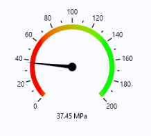
Use a Gauge form object to add a radial gauge to a form. This object is similar to the knob form object but is read-only and used to display a value by the position of a needle or arrow of a gauge. Optional tick marks and labels are used to indicate the range of values that the gauge can display. In addition to tick marks and labels, you can optionally configure a color scale to indicate the values. The figure below shows a gauge object together with a data display object, displaying the maximum stress in a structural mechanics application.
The Settings window for a gauge object is similar to that of a knob object. However, there are some differences. For example, there is no
Events section for a gauge object. The figure below shows the
Settings window for a gauge object.
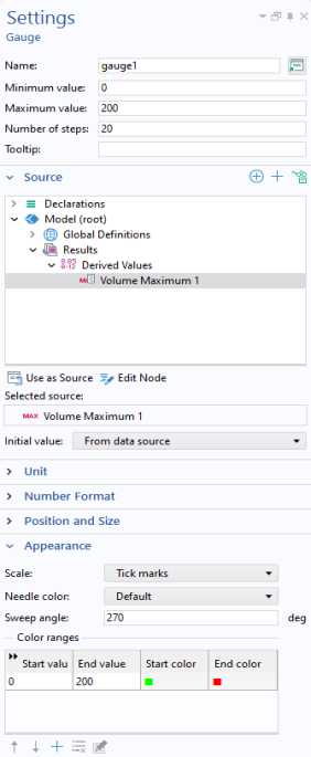
You can enter a Tooltip that is shown when hovering over the gauge. The settings for units are similar to that of a slider or knob.
In the Initial value list, select
From data source or
Custom value for the initial value for the gauge.
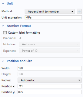
The Unit section is similar to that of a slide or knob object.
In the Number Format section, you can specify a custom format for the tick labels.
The Position and Size section will have different contents depending on if the form is using sketch mode or grid mode. You specify the
Width and the
Height is automatically set to the same value as the
Width (the
Height edit field is disabled). The
Radius value specifies the radius for the tip of the gauge object's needle. By default this is calculated automatically, but you can set it manually to make sure that gauge objects placed next to each other have the same needle radius.
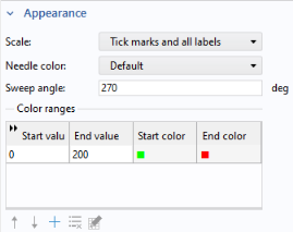
The Needle color takes its
Default value from the current color theme.
You can specify a sequence of color ranges for the gauge. Click the Add button in the table toolbar to add another color range, which opens a dialog.
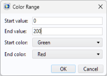
The Start color and
End color can take the value
Transparent which means that they get the same color as the current background color.
If the End value is less than the
Start value, then the color range is rendered backward.