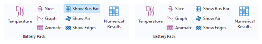
A toggle button form object or toggle item is a button with two states: selected and deselected. The figure below shows the ribbon toggle item Show Bus Bar from the Lithium Battery Pack Designer app, available in the Application Libraries under the Battery Design Module. In the left figure, the toggle item is in the selected state, while in the right figure, it is in the deselected state.
The two states of a toggle button are typically stored by linking it to a Boolean variable. The figure below shows the Settings window of a button that enables and disables the busbar part of a battery pack model depending on its state. The Boolean variable
isShowBusBar is selected in the
Source section.
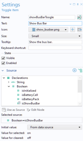
Enabled corresponds to the Boolean variable isShowBusBar being true, which indicates that the toggle button is selected. Disabled corresponds to the Boolean variable
isShowBusBar being false, which indicates that the toggle button is deselected.
For a toggle button, the Icon is displayed when the button is not selected, while the
Selected icon is displayed when the button is selected.
For a toggle item, the Selected icon option is not available. Instead, the
Icon will appear highlighted when the toggle item is selected.
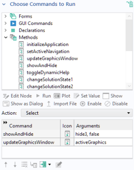
Below the Source section is the
Choose Commands to Run section, with a choice for
Action that represents two different commands for
Select and
Deselect. The figure below shows the
Settings window for
Deselect with calls to the custom methods
showAndHide and
updateGraphicsWindow.
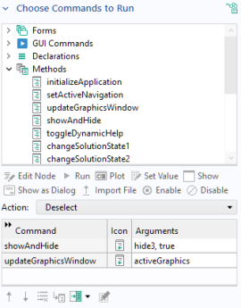
The next figure shows the command sequence for Select with calls to the same methods but with different input arguments to the first method.