Plotting The Results
One way to analyze the results is to plot the expression of interest. The first time you run the study, default plots are created, which you can visualize in the COMSOL Desktop.
The first plot group Temperature (ht) shows the temperature distribution, you may notice that the maximum temperature region is located in the bolt. To get a better rendering of the temperature distribution within the busbar, you need to edit the plot group.
1
To manipulate a plot group you need to know their tag. Use mphtags to get the list of the plot group tags available under the result node, and then the tag of the plot feature in the first plot group:
tags = mphtags(model, 'result');
feattags = mphtags(model.result(tags{1}));
2
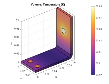
Activate a manual color range; set the minimum color value to 322.9 and set the maximum color value to 323.5:
surf = model.result(tags{1}).feature(feattags{1})
surf.set('rangecoloractive', 'on');
surf.set('rangecolormin', '322.9');
surf.set('rangecolormax', '323.5');
3
mphplot(model, tags{1}, 'rangenum', 1)
Note: If several plot types are available in the same plot group, you can define which color bar to display. The value of the rangenum property corresponds to the plot type number in the plot group sequence.