You are viewing the documentation for an older COMSOL version. The latest version is
available here.
Use a 2D Plot Group (

) to combine one or more 2D plots, such as surface plots and contour plots, and visualize the plots simultaneously. Use a
3D Plot Group (

) to combine one of more 3D plots, such as volume plots and slice plots, into one to visualize the plots simultaneously. The datasets that you can use are solution datasets for 2D and 3D solutions, respectively, but also, for example, cut planes from a 3D model in a 2D plot group or a revolved 2D axisymmetric solution in a 3D plot group.
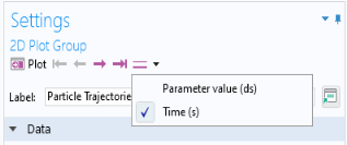
Select a Dataset. From the lists below select the solution to use. For
Parametric Sweep studies, select, for example, a
Parameter value as needed. For time-dependent problems, select a
Time. For eigenvalue and eigenfrequency analyses, select an
Eigenvalue or
Eigenfrequency. For solutions that contain multiple eigenvalues, the list includes entries such as
3241 (1) and
3241 (2) for selecting either of the two eigenmodes associated with the same eigenvalue. You can step through time, eigenvalues or eigenfrequencies, or parameter values using the
Plot Previous (

) and
Plot Next (

) buttons at the top of the plot group nodes and their plot nodes. You can also use the F6 and F7 keyboard shortcuts to step to the previous or next solution, respectively. To move to the solution associated with the first or last time, eigenvalue, or parameter value, click the
Plot First (

) or
Plot Last (

) button. For models with multiple levels of parameters and time, for example, use the list to the right of the
Plot Last button to choose the level for which you want to step through the solutions (see the figure below).
For all levels except Entire geometry, you can choose a selection of entities at that level from the
Selection list:
|
•
|
Manual, to select entities manually from the Graphics window or using the selection tools below.
|
|
•
|
All domains (for example), to select all entities at the selected entity level.
|
By default, the Propagate to lower dimensions check box is selected. If you clear it, only plots defined on the selected entity level will appear (for domains, a surface plot would then not appear, for example).
Select the Apply to dataset edges check box to only display dataset edges for the chosen selection of entities instead of for the entire geometry.
|
|
The selection made in the Settings window for the plot group can be overridden by Selection subnodes for the individual plot nodes in that plot group.
|
Select Save plot data to save the plot data in the model. This section only appears for the manual setting of the option for saving plot data. See
Saving Plot Data in the Model.
The Title type is automatically generated by default. Select
Custom,
Manual,
Label, or
None as needed. See
Plot Titles for Plot Groups and Plot Types for more information.
From the Color list, choose
Custom to define a custom color for the title, or choose one of the predefined colors (the default is
Black).
|
•
|
Select a View. The default is Automatic, which picks a view automatically. You can also choose any applicable view that is defined under Definitions or under Results>Views. It is also possible to choose New view. The plot then uses that new view, which appears as a View 2D (  ) or View 3D (  ) node under Views.
|
|
•
|
(2D only) The x-axis label and y-axis label check boxes are cleared by default, indicating that empty axis labels are used by default. Select the check boxes to enter labels for the x-axis and the y-axis. This can be useful for scatter plots, for example, where the axes represent quantities other than the x and y directions.
|
|
•
|
The Plot dataset edges check box is selected by default. Click to clear if required. Otherwise, select a Color ( Black is the default) or select Custom to click the Color button and choose a different color from a color palette. Select a Frame: Material (the default), Mesh, Geometry frame, Spatial, or Take from dataset.
|
To turn off the display of the color legends, clear the Show legends check box. If the
Show legends check box is selected, you can control the look and feel and position of the color legend using the settings below.
You can show or hide the maximum and minimum values for the plotted quantity that appear above and below the color legend using the Show maximum and minimum values check box. Turning off the maximum and minimum values can save screen space in the vertical direction.
|
•
|
Select Alternating (  ) to position the first color legend to the right of the plot, the second color legend to the left of the plot, and so on.
|
|
•
|
Select Bottom (  ) to position the color legends horizontally at the bottom of the plot window.
|
|
•
|
Select Left (  ) to position the color legends to the left of the plot.
|
|
•
|
Select Left double (  ) to position the color legends to the left of the plot with two color legends positioned on top of each other (tiled vertically).
|
|
•
|
Select Right (  ) to position the color legends to the right of the plot. This is the default position.
|
|
•
|
Select Right double (  ) to position the color legends to the right of the plot with two color legends positioned on top of each other (tiled vertically).
|
From the Text color list, choose
Custom to define a custom color for the text in the color legend, or choose one of the predefined colors (the default is
Black).
To override the automatic formatting of the numbers in the color legend, select the Manual color legend settingscheck box. Then adjust the formatting using the following settings:
From the Notation list, choose
Automatic to let the program choose decimal notation or scientific notation (E-notation) depending on the values of the displayed numbers. Choose
Engineering to use engineering notation, or choose
Scientific to only use scientific notation.
Select the Use common exponent check box (selected by default) to use a common exponent above the color legend. Clear this check box to instead display the full numbers, including the exponents, next to the corresponding levels in the color legend. One of these formats may be better suited to display the color legend if the plot window is small, for example.
Select the Show trailing exponent check box to display all numbers based on the precision used, including trailing zeros (for example, 5 is then displayed as 5.00 when the precision is set to 3).
In the Precision field, enter a positive integer (default: 3) for the numerical precision (number of digits displayed).
To override the automatic formatting of the numbers on the grid axes, select the Manual axis settingscheck box (2D) or
Manual grid settings (3D). Then adjust the formatting using the following settings:
From the Notation list, choose
Automatic to let the program choose decimal notation or scientific notation (E-notation) depending on the values of the displayed numbers. Choose
Engineering to use engineering notation, or choose
Scientific to only use scientific notation.
Select the Use common exponent check box (selected by default) to use a common exponent at the end of each axis. Clear this check box to instead display the full numbers, including the exponents, next to the corresponding axis tick. One of these formats may be better suited to display the grid if the plot window is small, for example.
Select the Show trailing exponent check box to display all numbers based on the precision used, including trailing zeros (for example, 5 is then displayed as 5.000 when the precision is set to 4).
In the Precision field, enter a positive integer (default: 3) for the numerical precision (number of digits displayed).
Select the Enable check box to activate the plot array functionality. All plot subnodes under the plot group node then get a
Plot Array section (see
Plot Array Settings for Plot Nodes), and by default its
Belongs to array check box is selected, so that all plots in the plot group are included in the plot array.
From the Array shape list, choose
Linear (the default) or
Square. By default, the size of the square array is the smallest square that the number of plots (which belong to the array) in the plot group would fit into. For example, with four plot subnodes, selecting
Square yields a 2-by-2 array. With five plot subnodes, selecting
Square yields a 3-by-3 array. For a linear plot array, choose an array axis (such as
x,
y, or
z in 3D) from the
Array axis list. For a square plot array, instead choose an array plane (3D only), such as
xy, from the
Array plane list. You can also choose, from the
Order list, if the ordering of the plots in a square plot array should be a row-major (the default) or column-major order. Choose
Row-major (the default) to first fill the available rows, or choose
Column-major to first fill the available columns. The order of the plots reflects the order of the plot nodes in the plot group, unless you have used a manual indexing for any of the plots. If you change the order, the plot array will reflect the new order when it is replotted.
From the Padding list, choose
Relative (the default) or
Absolute to control the padding between the plots in the plot array.
The default relative padding length is 0.3 (that is, 30% of the plot size). For a linear array, enter the value in the Relative padding field; for a square array, enter padding values in the
Relative row padding and
Relative column padding fields.
|
•
|
Select a Plot window. The Graphics window is the default setting, but any other plot window can be selected, or select New window to plot in a new window.
|
|
•
|
Select the Window title check box to enter a custom title (except for the Graphics window), which is then available in the Plot window list for all models. Click the Add plot window button (  ) to add a plot window to the list of available windows.
|
To add plots to a group, right-click the 3D Plot Group or the
2D Plot Group node to select as many as needed. Each plot group can have several plots combined to create a meaningful representation of the data.
|
|
|
•
|
In the 2D axis field, enter an integer between 1 and 15 for the number of digits for the values on the axes in 2D plots. The default setting is 4 digits.
|
|
•
|
In the 3D grid field, enter an integer between 1 and 15 for the number of digits for the values on the axes of the grid in 3D plots. The default setting is 3 digits.
|
|
|
|
See Table 21-11 for a summary of all the available plot types, including links to each plot described in this guide.
|