User Input Group GUI Options
You can use the User Input Group for two main purposes: controlling GUI layout and putting the same activation conditions on several user inputs. The latter is usually a consequence when implementing the first. Grouping of user inputs also makes it possible to define the section name and to create help contents for the section. The GUI layout option under the GUI Options section controls the behavior of a user input group. The available layouts are 
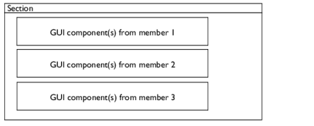
Group members below each other (the default), 
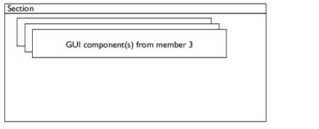
Group members placed in a stack, 
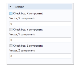
Create a widget for each vector component, 
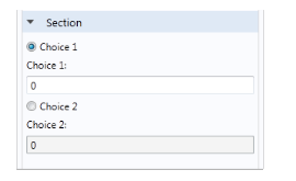
Radio buttons from first user input, others interleaved, Group members define columns in table, or Group members define a section.
Group Members Below Each Other
The GUI components that each group member represents appear below each other. The member can be another group, so the entire layout of that group gets a spot in this sequence. The figure below shows a schematic drawing of this layout.
Figure 2-1: A schematic of the layout of the option “Group members below each other”.
If any of the user inputs or user input groups has the option Hide user input in GUI when inactive selected, it gets hidden when inactive. It is still present, and its presence can be noted because it occupies a small empty space in the layout. If you only have one hidden member like this, you hardly notice it, but if there are several such hidden members in a row, you get a clearly visible empty space. You should then use the option Group members placed in a stack (see below).
Group Members Placed in a Stack
The GUI components of each member are placed in separate sublayouts, called cards. Each card can appear and disappear as a unit, giving the effect that a part of the layout changes instantly. The activation condition on each member controls when its card appears or disappears. Each card can contain several GUI components and other cards depending on the type of member it corresponds to. In this way, you can create an advanced nested dynamic GUI. See below for a schematic drawing of this type of layout.
Figure 2-2: A schematic of the layout of the option “Group members placed in a stack”.
Group Members Define a Section
The simplest and one of the most important GUI layouts is the section layout. You use it when you want specify what members that belong to a certain section. You specify the title of the section in the Description field.
The recommended way of creating a section is to use the Section node instead of the User Input Group node.
If you do not specify a section, there is a default section that can be good enough for simple layouts. There are several situations when the default section is never generated:
When you have at least one Constraint node in your feature. The constraint usually adds a special section for weak constraints and constraint type selection, so you must specify all other sections as a section group.
As rule of thumb, always add a section if you do not see the user inputs you expect.
Create a Widget for Each Vector Component
You can use this layout if you want to place a GUI component sequentially for each component of a vector-valued user input. The user input can either be a single-array vector or a double-array vector with a scalar or Boolean inner type.
A typical example is if you want to activate each vector component value with a check box. Then you create one double-array user input with the outer dimension set to vector and the inner dimension set to Boolean, and one single-array user input as a vector. Put both these user inputs as member to a group using this layout, and you get a layout like the screenshot below.
Figure 2-3: A screenshot of a window created with the layout option “Create a widget for each vector component.”
Radio Buttons from First User Input, Others Interleaved
Use this option when you want two or more radio buttons (option buttons) that control the visibility of other user inputs or groups. The first user input must have a set of valid values, each one representing one radio button. The number of group members except the first one has to be equal to the number of allowed values in the first user input. Similar to the previous GUI layout, you get the GUI components of a group member after each radio button. It is also common that you activate the group members depending on the value of the radio-button input. See Figure 2-4 that displays an example with two radio buttons. It needs three user inputs, where the first one has two allowed values.
Figure 2-4: A screenshot of a window created with the layout option “Radio buttons from first user input, others interleaved.”
Group Members Define Columns in a Table
Use this option when you want to combine several user inputs into a table GUI component, where each user input represents a column in the table. This requires that the user inputs are vectors and have the same dimension. In the Table height field you set the height of the table in pixels. You can control the behavior of the table through the check boxes listed in the table below:
Select to add a Clear button under a table to clear all data in that table.
The table columns get their headers from each user input if the Table headers list has the option Use user input descriptions. Choose Specify to enter them manually in the table that pops up below the list. The last table controls the settings for each column, where you specify the column settings in the corresponding row. The table below summarizes the available options.
Attach Activation on Group Members
Selecting this option means that all activation conditions under this group will be attached to the list of activation conditions for all members. The attachment will be done when using the interface in the Model Builder and can be used to do modifications of existing user input activations that you either cannot access or want to do selectively for a certain feature sharing a component with other features.